Sabres Unveil Ugly 3rd Jersey

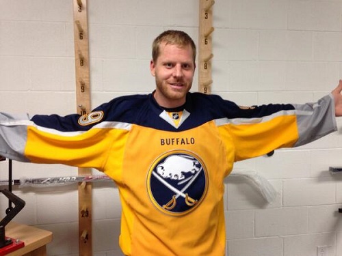
The Buffalo Sabres unveiled their alternate jerseys this week. What is notably different from this jersey compared to others they have had is the fact that it is very bright. These jerseys are bright yellow and actually have some gold in them as well.
It just may be the ugliest jersey ever! The spelling of BUFFALO on the front has a weird font. Why is there grey at the end of the sleeves? The blue on the front/back of the jersey makes it look like a cape. Are the Sabres supposed to be like Superman? The Sabres will have a lot of work to do on the ice if they want to do well this season.

(Steve Ott via Twitter)
I for one will not be buying this alternate 3rd jersey. It is way too ugly and I feel it does the original Sabres jersey an injustice. I wish teams would stop rolling out new alternate jerseys like newer models of a vehicle. I understand it is a business but enough is enough. If you want an alternate jersey to commemorate a special season or achievement, then do so. Just don’t come up with something that is so hideous and unappealing that sales of this product will be very low.
Remember when GM Darcy Regier said fans were going to suffer? He wasn’t kidding.

