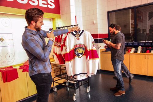
Reaction To The Florida Panthers New Jerseys For The 2016-2017 Season

Last season the Florida Panthers took one step forward in re-creating the club’s identity, as the Cats won their division (Atlantic) for just the second time in franchise history. A notorious non-playoff team making a statement and on the rise.
The Panthers took another step in the process of refreshing the team’s identity after Florida unveiled its’ highly anticipated new logos and uniforms on Thursday, June 2.
A fresh look for the Cats.
https://t.co/9qTXezGMwb pic.twitter.com/EqANB8VJ9s
— Florida Panthers (@FlaPanthers) June 2, 2016
Lookin' real fly behind-the-scenes at yesterday's jersey reveal.
pic.twitter.com/egRXrhItif
— Florida Panthers (@FlaPanthers) June 3, 2016
Rebranding. Gotta’ love it, right?
This hockey jersey enthusiast thinks so at least.
Top 10 NHL Social Media Posts From May
For the first time since the team’s establishment in 1993 the Panthers finally made a significant change to their logo and drastic modification to Florida’s overall jersey design too. The Panthers “wanted to start a new tradition” and that’s exactly what they did here, plus in the right direction.
Yes, the jerseys do somewhat resemble what could be labeled as a European Fùtbol team at first glance, but the uniforms are a perfect mix between simple and flashy.
Most may disagree, but I do like how the club added the horizontal stripe across the jersey, which may look familiar as it is a page out of the Montreal Canadiens book. A risky and bold move, but I think the Cats got this one right. Though, the piping running across the middle doesn’t wrap around the back of the jersey like the Habs’ design — a way of the Panthers putting their own stamp on things.
PODCAST: McKenna’s NHL Podcast
If you’re also thinking the design has a militaristic appearance as well — you’re right. The new primary logo’s inspiration was born from the 101st Airborne Division of the United States Army.
https://www.instagram.com/p/BGK8iOIhIw-/?taken-by=flapanthers
Keep in mind, Panthers owner Vincent Viola was a member of the Airborne Division in the late 1970’s. The prestige and noble new panther inside the crest was aimed to portray the military’s serious persona too. Though, the team’s alternate logo on the jersey’s sleeves is even cooler.
"We’re very, very proud to play in South Florida."
An inside look at the new uniforms » https://t.co/9qTXezpbED pic.twitter.com/91MXkU9woH
— Florida Panthers (@FlaPanthers) June 3, 2016
Another military inspired theme with the “earn your stripes” concept. Entering the preseason, the sleeves will entail the alternate logo, but a unique wrinkle was thrown into the mix. After the regular-season roster is finalized, players who make the club shall have “Florida” stitched on the home jersey and “Panthers” stitched on the road jersey — added above the secondary logo.
But wait it gets better…
The team’s captains will have banners added above the original banners as well, which will read “Captain” for the the player who dons the “C,” and “Alternates” for those who carry the honor of being an alternate leader.
What Else I Like & To Know
For starters, the flat gold color works well with the Panthers’ red and blue. I like how it’s present on the NHL’s shield in the collar area of the jersey also.
The team’s navy blue and white helmets now have decals that entail the updated original Panthers’ logo, which looks good to the point where perhaps the club could have just used it as the new primary logo, no?
https://www.instagram.com/p/BGK9WWYBIyo/?taken-by=flapanthers
In fact, to complete the potential trilogy I think Florida should get a navy blue alternate jersey in the near future with the updated jumping panther as the logo on the front of the sweater…a tribute towards the team’s past.
The updated look for the buckets also has the secondary logo in the bottom left corner, which adds diversity in comparison to the rest of the NHL. But, will the captains’ banners be added on the the helmets as well? I think they should be.
You may have noticed the sweaters have ties, but that they’re not drawstrings — Reebok decided to add in the “X” pattern to represent and portray the State flag.
Personally, I like when teams at least a stripe or two added to the bottom portion of the jerseys, but considering the overall design the Panthers can get away with not having any. I felt like the previous jerseys had too much of an apron or table cloth look, so the navy blue trim at the bottom of the sweater does add another small compliment to its’ look.
The new font is great and like anything else recently marketed in professional sports has a “clean” look. The number’s font has a unique twist to it, and it was a good call to place additional numbers on the shoulders — and not in the left chest area like some clubs have turned towards since Reebok started manufacturing the NHL’s uniforms.
I am a bit surprised there were no stripes or anything at all added to the player’s pants, but maybe that’s where simple comes back into play…
Still, the Florida Panthers deserve a lot of credit here and they with out a doubt obtained their goal — the sweater has character.
So, now we wait for an alternate jersey and of course what the Toronto Maple Leafs new uniforms design will be too.
Tweet your NHL related questions to @KMcKenna_tLT5 to have them answered over McKenna’s NHL Podcast and be sure to use the hashtag #McKennasDigest
Kyle McKenna covers the NHL Hooked On Hockey Magazine. He can be reached on Twitter (@KMcKenna_tLT5) or via email (mckenna.kyle91@gmail.com)


