Anaheim Ducks’ New Alternate Anniversary Jersey Is Disappointing
A 'Mighty' Mistake

The Anaheim Ducks are Mighty, again.
Well, sort of.
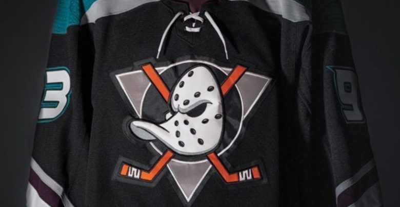
The Ducks unveiled the team’s new alternate jersey on Saturday, which also honors the organization’s 25th anniversary season. At first glance, the jersey looks phenomenal, especially with the team’s tribute towards the Ducks’ original and iconic logo.
https://twitter.com/AnaheimDucks/status/1021099330999119873
While this jersey is disappointing, let’s start with the positive traits that the sweater will display at the Pond in Southern California for the upcoming season.
https://www.instagram.com/p/BlgeVb4jqOc/
What the Ducks did right
NHL fans alike all figured that the team would be using a modified version of the original “Mighty Ducks” logo for the team’s seventh alternate jersey in franchise history. Anaheim had used a similar version of the classic crest for the team’s previous alternate sweater (2015-2017), which entailed an orange base.
But fans may notice a minor and commendable change to the crest. The crossing hockey sticks are more vibrant in large thanks to them being colored in with one of the team’s current and primary colors – “Anaheim Ducks Orange.”
The diagonal and tri-color striping located at the base and lower half of the jersey’s sleeves should look familiar, too. It’s a modernized design from the team’s original jersey. Though the “Ducks Jade” was previously used to fill up a majority of the original jersey’s bottom half of the sleeves, but now that aspect has been cut short.
New Anaheim #Ducks uniform similar, but not quite the same as the old Mighty Ducks #NHL
More pics & details in our post here: https://t.co/lZ1kqB2Cbc pic.twitter.com/z4hNnbAgHs
— Chris Creamer (@sportslogosnet) July 21, 2018
There’s one overlooked detail to this sweater that Hooked on Hockey Magazine really appreciates, though. The player’s number and nameplate fonts are implemented from the current design. The numbers and nameplate lettering have that “webbed” design which enhances that “Mighty Ducks” aurora.
What the Ducks did wrong
First and foremost, the base of the jersey shouldn’t be black. The team made it clear that they wanted to incorporate and tribute all of the Ducks’ jersey history for this anniversary sweater, but the black-base ruins the “Mighty Ducks” theme.
Having the Ducks Orange and webbed-theme font are more than enough characteristics that represent Anaheim’s current brand. It’s fair to argue that the base of the jersey should’ve been the team’s eggplant (purple) that was used on the team’s original dark colored sweater up until the 2006-07 campaign.
Now, the shoulder yokes weren’t a terrible idea, but keep in mind that the original design’s shoulders only entailed an alternate logo patch. This design would be better with a more simple approach especially since its main point is to honor a classic sweater.
https://twitter.com/AnaheimDucks/status/1020779257344081920
Speaking of the shoulder yokes…the team’s current logo is stitched onto both shoulders and that’s a big mistake. Again, it takes away from the jersey’s simplicity and also makes it portray a minor league appearance.
Teams that play in the American Hockey League (AHL) usually place their respective NHL team’s main logo on both shoulders to display that “affiliation,” which is a good look for minor league clubs. the San Diego Gulls, the AHL affiliate for the Ducks, use Anaheim’s main crest for the left shoulder yoke.
https://twitter.com/SDGullsAHL/status/1014599185604042752
If anything, choose one or the other for the shoulder area of the jersey. Having both the yokes and logo added to those areas has a busy appearance.
With that being said, the collar should entail two colors. Using that Ducks Jade and white for the collar would make that area of the jersey more appealing and it would be an accepted subtle change.
The Ducks will wear the alternate anniversary sweater for the team’s home opener at the Honda Center on Oct. 8th, which will also be played against a former Western Conference rival in the Detroit Red Wings. Fans should expect to see a number of highlights and tributes to the 2003 Ducks squad that upset Detroit during the first round of the Stanley Cup Playoffs that year.
Tweet your NHL related questions to @KMcKenna_tLT5 to have them answered & be sure to use the hashtag #McKennasDigest
Kyle McKenna covers the NHL for Hooked On Hockey Magazine. He can be reached on Twitter (@KMcKenna_tLT5)


