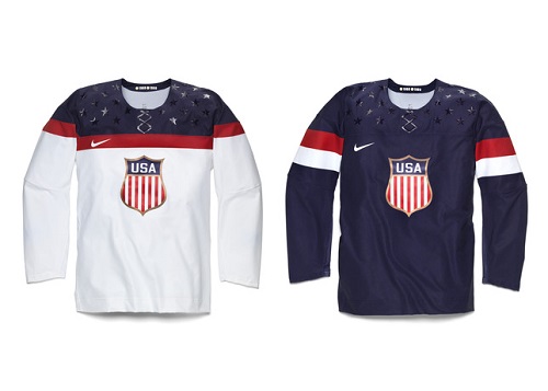
Nike revealed the jerseys that Team USA will be wearing in Sochi, Russia, for the 2014 Olympic Games, and it’d be an understatement to say they missed the mark. There’s really no other way to say it: Team USA’s jersey are bad. Check out the new designs yourself as we pick our way through this train wreck.
The crest itself isn’t too bad, and it does give a nod toward the similar crests worn by Team USA for about 30 years, starting in 1920. It’s unfortunate that IOC rules prevent the use of federation logos in Olympic competition, because the current USA Hockey logo with the stylized-S is really fantastic. In its stead, the 2014 design does a serviceable job, though Nike couldn’t have gone wrong with a simple ‘USA’ across the chest.
The real tragedy of this design shows up around the shoulders. The jersey is covered in dark blue reflective stars that look like they’d fit in better on a child’s bedroom ceiling than a on hockey sweater. However, the stars do provide a somewhat valuable service in momentarily distracting from the worst aspect of this jersey: the fake collar. The ‘collar’ is Nike’s Flywire technology, designed to “reinforce the neck area while providing a closer fit to prevent slipping,” which would sound much more reasonable if that same goal couldn’t be accomplished by adding a real collar. The shiny faux-retro laces lead me to think that those at Nike have never watched the sport, and believe Olympic hockey is some sort of ‘Tron’-inspired laser tag tournament.

(NikeInc.com)
What’s unfortunate is that (subdued bedazzling aside) there are some nice elements to this design, but they’re completely hidden away. The inside of the jersey’s right sleeve (seen here) pays homage to the gold medal-winning team of 1960 and 1980. The inside of the collar (seen here) bears the message, “Land of the Free, Home of the Brave,” which is a nice touch. It’s a shame Nike incorporated its best ideas in places no one can see.
Perhaps the most impressive feat is Team USA’s Nike designed jerseys manage to be over-cluttered with bad ideas and somehow, it’s still boring. After the bottom the crest, the jerseys just seem to end. While this might not be so bad with the whites, if Team USA wears navy blue pants and helmets (as they did in 2010), that’ll be an awful lot of blue. The white and red on the blue jersey creates a really sharp contrast, but unfortunately, there isn’t enough of it. Despite the miscues with the star-studded shoulders and the ridiculous fake collar (which mercifully might not show up on the TV broadcast), these jerseys look generic.
Will these new jerseys have any affect on Team USA’s performance in Sochi? Probably not. Any team that can roll out Zach Parise, Ryan Kesler, and Patrick Kane on a single line doesn’t need to be too fashion conscious. Still, it’s tough not to feel a little let down by Nike’s design for the Sochi Olympics. With all that talent on the roster, it’s still important not to judge a book by its cover, even if that cover is particularly stupid and uninspired. Nike has four more years until the 2018 games in South Korea. Let’s hope they come up with something better between now and then.


